Fantasy Meets Sci-Fi
Pair mythic, human craft with precise, exploratory technology: the centaur and Fraunces beside portal geometry, the moon, and clear analytical evidence.

Fantasy meets sci-fi: a mythic centaur and expressive type meet portal geometry, precise interfaces, and visible evidence. Start with the studio's character, follow the tokens and text roles, then compose the shared components.
Centaur7 is an independent technology studio with a fantasy meets sci-fi aesthetic. The hand-drawn archer, Fraunces, and Oatmeal bring myth, craft, and human judgment. The portal, MoonStars control, Yale Blue and Portal Blue, precise layouts, and analytical displays bring exploration and computational power. Together they make the work feel imaginative and dependable.
Use that character in studio framing while keeping professional introductions and project evidence direct and readable. Bitting supplies the website's reusable components; it is not the Centaur7 brand. Each marquee project keeps its own artwork. Orbital lines and star details remain design-study ideas until a shared, documented composition earns them through brand expression or useful structure.
Pair mythic, human craft with precise, exploratory technology: the centaur and Fraunces beside portal geometry, the moon, and clear analytical evidence.
Use the studio's four colors and existing artwork to express its character. Keep supporting ornament quiet, respect reduced motion, and make project facts and actions easy to read.
Use a Bitting component when it supports the required content and behavior.
Set brand colors and type through semantic tokens instead of changing package markup.
Arrange Bitting components around Centaur7 project data and editorial content.
Every component should help someone understand the work or take a useful action.
Current exceptions: the hand-drawn mark, its hero lockup, the keyboard skip link, editorial typography, and pre-Blazor loading and error recovery. NativePillButton supplies a real HTML button around Bitting’s non-interactive pill presentation. The same owner supports menu and theme actions before WebAssembly loads; site.js owns their state.
--bitting-md clear space beside the mark and --bitting-xl above and below it.--c7-mark-compact) is the default and minimum size for navigation, footer, and standalone marks. Hero (--c7-mark-hero) scales with the viewport for the studio lockup and loading screen.--c7-logo-backing; object-fit containment preserves proportions.The canonical centaur artwork is rendered by CentaurMark in production. favicon.svg carries the same artwork and is the only declared browser icon. The web manifest references that same SVG. There is no separate Apple touch icon or PNG fallback. Icon and manifest URLs are root-relative because Centaur7 is hosted at the domain root.
When adding a raster or Apple variant, derive it from the canonical SVG, update every declaration together, and check the final rendered head and every eligible asset on a deep route.
A project earns its canonical logo; About uses Adam's portrait; Colophon uses Bitting's publication bookmark. The words remain visible and speak for the visual. ConceptIdentity keeps the name and its single visual together; ConceptLabel carries that pairing into navigation and the actions that open the concept. The symbol is hidden from assistive technology, so a link is announced once.
ProjectCatalog owns each project's name and canonical logo. The same identity appears in project rows, About's project connections, brief openings, and project actions. Bitting's branded title wordmark remains its approved heading variant. About's portrait identifies the person behind the studio; Colophon's reserved bookmark identifies the publication's making and credits and also accompanies its page title.
ConceptVisual owns Inline, Card, and Hero sizes. Inline uses --c7-concept-mark,
a Bitting icon-size alias, and the shared small gap. Navigation aligns the visual frames and labels to the left;
text may wrap inside its own column at narrow widths. A stable Oatmeal backing keeps logos legible in both themes and
selected controls. Inline and Card frames clip their image backgrounds to the shared circle. The package symbol uses
--c7-concept-symbol-size, half a base unit smaller than the frame, for breathing room on every side. Portraits retain a circular crop;
project artwork stays contained and keeps its colors. Topic headings use words without an added symbol; recurring destination concepts retain their one canonical visual.
No extra concept color or status meaning is assigned. Generic actions keep their conventional symbols.
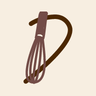
Dollop's approved D-and-whisk monogram is the compact mark in navigation, actions, and project rows;
the full wordmark is reserved for Hero and print branding. The monogram is copied unchanged from Dollop's
icon-192.png. Bitting's existing pip and B retain their colors, proportions, and relative placement;
its SVG viewBox balances the surrounding clear space so the artwork sits centrally in the shared frame.
Sting's viewBox centers the visible hornet from the top of its wing to the bottom of its stinger,
with equal clear space on opposite sides. Center painted artwork, rather than an export canvas's empty margins;
keep the canonical paths and shared frame sizing unchanged.
Owners: ConceptIdentity and StudioDestinations, ProjectCatalog, ConceptLabel, and ConceptVisual.
Centaur7 has four brand colors. The logo draws Yale Blue, Portal Blue, and Athletic Red, and stands on Oatmeal. Bitting's semantic tokens map to these colors so package components use the Centaur7 theme without component-level overrides.
The light page is Oatmeal at half strength. Yale Blue body text measures Lc 84.5 on full Oatmeal, under the floor of 90, and Lc 90.8 on the page. Keep full Oatmeal for ground that carries no body text.
White is the neutral surface color in light mode. Cards and resting controls use it; the page uses the light Oatmeal tint. Fill communicates priority and state. Apply these roles through the shared tokens and Bitting components.
Primary actions, the current navigation destination, settings that are on, and expanded disclosures use the active pair. Secondary actions, unselected destinations, settings that are off, and collapsed disclosures use the resting pair. Unavailable controls announce their disabled state. Plain text links use the current text color with no fill or pill elevation.
Enabled pills use SolidDrop. Unavailable and informational
specimens use Solid. Bitting owns pill geometry, type, hover, focus, and pointer targets.
Page CSS may arrange a control; it must not invent a fill, outline, radius, shadow, or type treatment.
Menu and the theme control both use Bitting's small pill. Their appearance comes from BittingPillAppearance and its ForSelection mapping. Menu announces
aria-expanded and aria-controls; the theme control announces
aria-pressed. Their state changes the fill pair, while their shared anatomy stays consistent.
Literal colors live only in the root token block. A test rejects a hex value anywhere else in the stylesheet.
Both schemes use the same four colors. In dark mode Oatmeal carries the text and the plate behind the logo. The dark map changes semantic text, surface, border, focus, and chart tokens instead of styling individual components. Every production route must pass the same automated accessibility scan in both schemes.
Bitting owns the fluid type scale. Centaur7 maps each text role to one of its five size tokens, then adds only the brand typeface, weight, tracking, and rhythm.
The anchor interpolates from 1rem to 1.125rem across 320 to 1120 CSS pixels at the default root size. Its rem intercept preserves reader font preferences. The browser owns the root size; the body consumes the anchor once. Other steps retain Bitting’s phi relationships.
Page Title
bitting-text-display · --bitting-xl
Fraunces, medium. StudioHero and BittingPageHeader identify each route.
Exact Fluid Expression:
--bitting-xl
Rhythm and emphasis: No role margin; the page-header lockup owns its gap. Title case.
Implementation ownerContent Heading
bitting-text-heading · --bitting-lg
System UI, bold. BittingSectionHeader names a content group on every route.
Exact Fluid Expression:
--bitting-lg
Rhythm and emphasis: No role margin; section lockup provides --c7-section-gap before, --bitting-md after. Title case.
Implementation ownerCard Title
c7-type-card-title · --bitting-md
Fraunces, medium. ProjectCard and About roster captions identify projects and teams.
Exact Fluid Expression:
--bitting-md
Rhythm and emphasis: No internal margin; the identity or caption composition owns the gap. Preserve proper names.
Implementation ownerInterface Heading
bitting-text-compact-heading · --bitting-md
System UI, heavy. Bitting headers and explanatory subsections label the working interface.
Exact Fluid Expression:
--bitting-md
Rhythm and emphasis: Package roles have no margin; native h3 has --bitting-xs after. Title case.
Implementation ownerEditorial Body
c7-prose · --bitting-md
Fraunces, regular. Home introduction, About narrative, and every case-study story.
Exact Fluid Expression:
--bitting-md
Rhythm and emphasis: --bitting-md between story paragraphs. Bold marks emphasis; sentence case.
Implementation ownerInterface Body
c7-interface-body · --bitting-md
System UI, regular. The body default carries interface explanations; bold marks emphasis.
Exact Fluid Expression:
--bitting-md
Rhythm and emphasis: The containing composition owns paragraph spacing. Sentence case.
Implementation ownerReading Body
bitting-text-body · --bitting-md
System UI, regular. Bitting feedback and empty-state explanations.
Exact Fluid Expression:
--bitting-md
Rhythm and emphasis: Relaxed line-height; the containing feedback component owns the gap. Bold may mark emphasis.
Implementation ownerFact Label
bitting-key-value-text__key · --bitting-md
System UI, regular. BittingKeyValueText names the value; Size.Small selects the small token.
Exact Fluid Expression:
--bitting-md
Rhythm and emphasis: Inline key/value uses --bitting-line-height; Stacked uses --bitting-line-height-tight with no extra gap.
Implementation ownerFact Value
bitting-key-value-text__value · --bitting-md
System UI, bold. BittingKeyValueText keeps the number beside its canonical label.
Exact Fluid Expression:
--bitting-md
Rhythm and emphasis: Inline values have --bitting-qtr-md before; Stacked removes it. Size follows the same selection as the key.
Implementation ownerCompact Action
BittingPillLink Size.Small · --bitting-sm
System UI, regular. Navigation, footer, and toolbar use the compact size; main actions use Medium.
Exact Fluid Expression:
--bitting-sm
Rhythm and emphasis: The pill owns padding, target, focus, disabled state, and selected emphasis. Title Case.
Implementation ownerFigure Label
bitting-chart-label bitting-font-sm · --bitting-sm
System UI, bold. ChartLabelPlan selects one of the five fluid steps for the measured label group.
Exact Fluid Expression:
--bitting-sm
Rhythm and emphasis: Measured SVG geometry selects size and wrapping; all labels in one axis share its plan. The frame measures the reader’s actual root.
Implementation ownerSupporting
bitting-text-supporting · --bitting-sm
System UI, regular. Header context, roster places, and supporting descriptions.
Exact Fluid Expression:
--bitting-sm
Rhythm and emphasis: No role margin; its paired lockup owns the gap. Sentence case.
Implementation ownerMicro
bitting-text-micro · --bitting-sm
System UI, medium. Bitting’s brief metadata labels; never long reading copy.
Exact Fluid Expression:
--bitting-sm
Rhythm and emphasis: No role margin. Sentence case; use body for instructions.
Implementation owner--bitting-mdInline Code
code · --bitting-md
System UI. Code inherits its surrounding role’s clamped size, weight, and line height; this specimen uses the body anchor. A token-backed wash identifies a literal.
Exact Fluid Expression:
--bitting-md
Rhythm and emphasis: Inline, with no outer margin; --bitting-eighth-md horizontal inset. Long identifiers wrap; preserve literal case.
Implementation ownerEach expression contains the same clamp, either directly or inside Bitting’s scale calculation. Its minimum is the role at 320px, its preferred rem-plus-vw value interpolates to 1120px, and its maximum applies from there. Values assume a 16px root; increasing the reader’s root increases every bound and intercept.
Reading roles use --c7-ink-current, directly or through Bitting’s primary,
secondary, and gray aliases: Yale Blue in light mode and Oatmeal in dark mode. Supporting context may use
--bitting-muted (Ink at the documented opacity, or Silver). Actions use the package’s typed
BittingPillAppearance: Primary pairs the active ink with the canvas; Secondary reverses them.
Native links retain underlines, including visited links. Focus adds the shared ring; disabled actions retain
their words and use Bitting’s disabled opacity and non-operable semantics.
Supporting and Micro share Bitting’s small step. Supporting explains context; Micro is a short metadata label with medium weight. Keep both meanings, with no extra size scale. The Card Title is Fraunces for project identity; interface headings remain system UI. Refining the Card Title updates both project cards and the About roster captions.
--bitting-xs--bitting-sm--bitting-md--bitting-lg--bitting-xlValues below are read from the running stylesheets in the active theme. Resize the page or change the theme, then refresh the reading. Type expressions retain the package’s calculations; no specimen maintains its own scale.
Semantic roles keep text, canvas, surfaces, and chart categories coherent in both themes.
--c7-ink--c7-ice--c7-flame--c7-oatmeal--c7-canvas--c7-surface--bitting-primary--bitting-muted--bitting-on-accent--c7-series-ice--c7-series-flameColor names retain one value in both themes. Semantic assignments select from this palette; project accents identify artwork, never status.
--c7-white--c7-light-oatmeal--c7-pale-ice--c7-deep-red--c7-charcoal--c7-slate--c7-silver--c7-muted-teal--c7-slate-teal--c7-salmon--c7-deep-teal--c7-bright-teal--c7-rose--c7-sting-gold--c7-dollop-cream--c7-bitting-ember--c7-bitting-blue--c7-bitting-sky--c7-bitting-peachThe clamped anchor has rem bounds and a rem-plus-vw preferred term. The remaining steps compose that anchor.
--bitting-md--bitting-phi--bitting-xs--bitting-sm--bitting-lg--bitting-xl--c7-font-display--c7-font-ui--bitting-font-weight-medium--bitting-font-weight-heavy--bitting-text-display-line-height--bitting-line-height-relaxed--c7-section-gap--c7-measureBittingTile owns boundaries; selectable pills use SolidDrop and disabled pills use Solid. Avoid nested surfaces without a grouping need.
--bitting-tile-padding--bitting-border-width--bitting-border-subtle--bitting-radius--bitting-radius-sm--bitting-radius-pill--bitting-muted-gray--bitting-muted-gray-80--bitting-muted-gray-40Keyboard focus uses a visible ring. Targets follow the package floor; reduced motion collapses decorative transitions.
--bitting-focus-ring--bitting-focus-width--bitting-focus-offset--bitting-target-min--bitting-duration-fast--bitting-duration--bitting-ease--c7-motion-reducedCentaurMark owns studio sizes; ConceptVisual owns concept frames and inner symbol clearance. BittingIcon supplies the single interface icon family; project logos remain canonical project assets.
--c7-mark-compact--c7-mark-hero--c7-concept-mark--c7-concept-symbol-size--c7-logo-backing--bitting-icon-xs--bitting-icon-sm--bitting-icon-md--bitting-icon-xl--bitting-content-max-widthThe host grid uses 36em for the roster’s third column and a horizontal studio hero, 48em for paired content, 62em for desktop navigation and five roster photos, and 75em for paired charts. Bitting’s contents control now switches at 100em, following the same font-relative convention. Every Centaur7 query uses the listed em values; the reader’s font preference therefore moves the layout thresholds. Type remains fluid between them.
These are live Bitting components from the pinned package, shown in the Centaur7 theme. The guide demonstrates behavior and composition instead of redrawing their anatomy.
| Family | Components |
|---|---|
| Charts | 20 |
| Primitives | 14 |
| Drop downs | 8 |
| Headers | 8 |
| 20 more families | 49 |
Recurring titles are never reassembled page by page. Each lockup below names its production primitive, order, spacing, and responsive rule.
StudioHero + CentaurMark + BittingPageHeader. Mark, page title, editorial supporting copy, then optional actions. --bitting-md internal gap, --bitting-xl vertical padding. Left aligned; the mark stacks above the copy below 36em or when the reader’s text size needs more room. Its 6–10.5rem width interpolates across 320–1120px; project artwork likewise grows 4.5–6.75rem over that range.
Implementation owner · Home and this guide’s opening.
BittingPageHeader. One visible h1, optional lead, description, then actions. --bitting-sm internal gap; --bitting-lg top and --bitting-md bottom padding. The studio and project containers own their outer rhythm.
Implementation owner · Every content route; Bitting’s TitleMark slot keeps the wordmark inside h1.
BittingSectionHeader. Section title, then rule. Eyebrows are omitted. Centaur7 omits optional topic icons; named concepts use their canonical visuals. Left aligned; package-owned internal gap, --c7-section-gap above, --bitting-md below. Reflows at narrow widths.
Implementation owner · Production sections and both guides.
BittingHeader or BittingChartHeader. Compact title, then rule. Eyebrows are omitted. Topic labels remain plain. The enclosing BittingTile owns outside space. Use the chart header for large figures; pip emphasis remains a separate choice.
Implementation owner · Project screenshots, capability tiles, and Bitting charts.
Centaur7 components arrange recurring studio content with Bitting components.
The package owns native details/summary, its persistent label, target, focus, and supporting-content spacing. It works without JavaScript; the host supplies only outside rhythm and stable destinations.
Implementation owner · All expandable contracts in this guide and the Bitting brief’s chart-data tables.
One BittingHeaderTile composition owns linked project screenshots, image boundaries, responsive sizing, and accessible link labels. Screenshot paths come from ProjectCatalog.
Implementation owner · Sting Coverage and Weekly Dollop briefs.
Bitting’s bitting-stack owns vertical alignment and the standard gap. Compact, cozy, and relaxed variants select existing spacing steps; the tile keeps its shared inset.
Implementation owner · Site content tiles and portfolio compositions.
NativePillButton shows Bitting's MoonStars glyph, announces Dark Mode with aria-pressed, defaults to light mode, and remembers an explicit choice. Its shared browser handler works on static and WebAssembly routes; the selected state uses the shared Primary color pair. The control glyph inherits that pair's foreground in either state.
Implementation owner · SiteNav on every route, including this guide.
A native button supplies keyboard activation while an actual BittingPillButton, configured as non-interactive, owns the appearance. Typed pressed and expanded inputs become ARIA; the browser handler changes state and the named label slot. State tokens choose the Primary or Secondary semantic pair. The wrapper makes the fill transition immediate so its text never crosses a low-contrast intermediate color. This follows the native-wrapper precedent in BittingFirstOpenGuide.
Implementation owner · ThemeToggle and SiteNav on every route.
c7-action-group arranges BittingPillLink actions with at most one primary action. Selectable pills use SolidDrop; non-selectable pills use Solid.
Implementation owner · Home, Colophon, footer, and failure recovery.
Reserve the pip for governing principles and next actions. Ordinary tile titles use BittingHeader; large figures use BittingChartHeader.
Implementation owner · Home’s person tile and this guide’s governing principles.
A semantic article in the project list uses ProjectMark, the shared Card Title and Editorial Body roles, and a Supporting status line. The logo and name form one native underlined link to the brief. Summary and status align with its words using the shared logo-size and gap tokens. There is no separate button, repeated mark, review-date field, or enclosing tile. Keep the canonical tagline for project branding; the catalog's Summary explains what the product does.
Implementation owner · Home’s selected work and the live example below.
BittingTile and BittingKeyValueText provide facts with visible supporting captions and an optional chart slot.
Implementation owner · All three project briefs.
ci.73 supplies rendering and viewport placement. site.js extends the public bittingTooltipFixed attach/detach boundary so Escape dismisses without moving focus and pointer inspection persists across the gap. The bridge uses --bitting-duration-fast. Retire this adapter when an upstream release passes the focused tooltip regression without it.
Implementation owner · Corner explanations on the Bitting brief and this guide; light and dark keyboard/pointer checks.
One comparison composition consumes BittingInventory.FamilySummary through BittingSummaryTable. The family name and count share a row; no color key or legend override is needed.
Implementation owner · The Bitting brief and this guide’s inventory specimen.
One sequence of Bitting page title, surfaces, instruments, story, and a consequential choice. Technical Evidence uses native document navigation to the guide anchor, including when leaving an interactive page. The summary and catalog-owned role sentence use editorial body text; the live-site action follows on its own line. Reserve key-value components for short facts, rather than wrapping a long role description beside a large label.
Implementation owner · All three /work routes.
ConceptIdentity keeps a recurring name and its one visual together. ConceptLabel composes the hidden visual and visible words with the shared small gap. ConceptVisual renders the canonical image or actual Bitting symbol; typed Inline/Card/Hero sizes own geometry and backing. ProjectMark delegates to this same visual owner for established project compositions.
Implementation owner · Primary navigation, project actions, project rows and openings, About connections, the Colophon title, and both living guides.
A typed outline renders a page rail or a compact disclosure, with native hash destinations and a current-location enhancement. Centaur7 supplies the Title Case trigger and omits the optional context eyebrow and topic icon.
Implementation owner · Style Guide and Domain Guide.
BittingAlert explains status. BittingEmptyState owns the Telescope illustration for missing content and a next action; Centaur7 inherits that illustration rather than assigning it to topics. The static boot error offers Reload Page and a keyboard-operable Dismiss Error.
Implementation owner · Not Found, this guide, and boot failure.
PortfolioPage composes BittingSlide, BittingPageHeader, and BittingPillLink. Centaur7 exports consume the site’s tokens and mark; project pages load their production theme snapshots. The fixed print canvas is a deliberate format variant.
Implementation owner · Both downloadable portfolio editions.
BittingChartFrame measures each chart. Typed series select Centaur7Series tokens; chart legends retain readable text. KPIs use BittingKeyValueText.
Implementation owner · Bitting’s three charts, family table, and case-study facts. Numeric geometry is supplied by the package’s measured frame; the host’s --c7-chart-height is shared by the four figure containers.
The package owns its pip and approved sizes. Centaur7 uses Hero inside the Bitting page’s h1 and the portfolio without rebuilding the artwork.
Implementation owner · /work/bitting.
A reusable library of charts and controls for Blazor applications.
Maintained
This is the production ProjectCard. Its linked logo and name open the brief; a concrete summary explains the product, followed by a quiet status line. Space groups the list without another surface, border, or button. Review dates and release details belong in the project evidence.
The selected navigation pill is inverted and announces the current page. Other destinations stay secondary. Disabled specimens are unavailable by mouse and keyboard. The theme control keeps its name while its pressed state changes.
Use BittingHeader for ordinary tile identity, BittingChartHeader for large figures, and BittingPipHeader for a governing principle or next action. A pip is emphasis, so repeating it on every specimen weakens the distinction.
Every action is reachable and focus is visible. The skip link stays on the current route and query and moves focus into main content. Escape closes the mobile menu and returns focus to its trigger. Route navigation focuses the named fragment, or the new h1 when no fragment is supplied.
Every route clears the same WCAG scan in light and dark mode. Text and controls meet AA contrast in both.
Every pill takes its hit area from the package's own target token. The menu and theme controls both use the small Bitting pill.
Type and spacing follow the Bitting scale. Layout breaks only when content requires it.
Feedback and empty states explain what happened and offer a useful next move. The pre-Blazor failure shell uses native semantics because components cannot run there. No form or modal dialog is currently part of this app; add labels, instructions, keyboard and focus contracts at the shared owner when introducing one.
Capitalize principal words in titles, headings, buttons, and menu labels; keep articles, conjunctions, and short prepositions lowercase unless they begin or end the title.
Body copy, help, and messages use sentence case. Buttons and menu labels use Title Case. Eyebrows are banned across the Centaur7 brand, regardless of case. Put the useful words in the heading or body; project status follows its description as supporting context rather than sitting above its name.
State the point on the front foot. Use a question only when the question itself matters.
Name the project, component, metric, or decision before describing it.
Use the same word for the same concept across every page.
Keep only words that identify, explain a decision, provide evidence, or support an action.
Prefer a number, model, interface, or specific tradeoff to an unsupported adjective.
The simplest interpretation of a sentence should also be the intended one.
Use straightforward language and remove slogans, jargon, and unnecessary cleverness.
A package upgrade starts with the component library. The pinned package owns typed pill appearances. Its active-link background still caches across state changes, so SiteNav keys a link on its current state. Adam stewards this adapter; remove it only after the navigation contrast regression passes without it. Centaur7 then removes any local workaround the package has made obsolete, refreshes this page, and runs the complete suite. The examples on this page must match the production implementation.